
← Projects
Investment website · Sri Lanka
BlueHarbor Capital
We built this site around how BlueHarbor talks to investors. The first screen makes their point, the properties are laid out as a set we designed for them, and the inquiry stays on the page so a visitor can say what they are looking for.
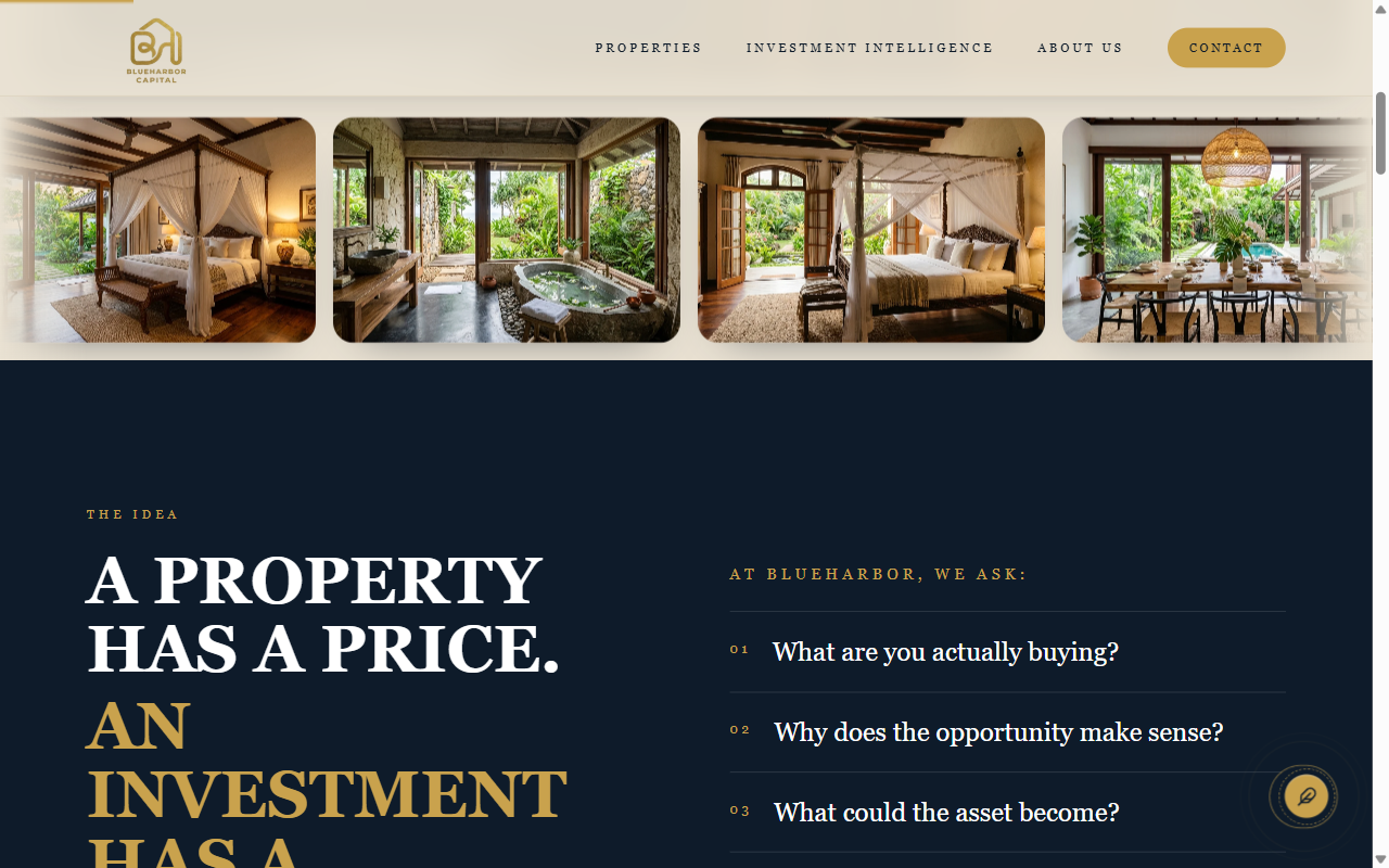
Opening
We led with their point of view.
The first screen is custom for this firm. It states the idea first, then uses the residence photos to support it, instead of opening on a list of buildings.
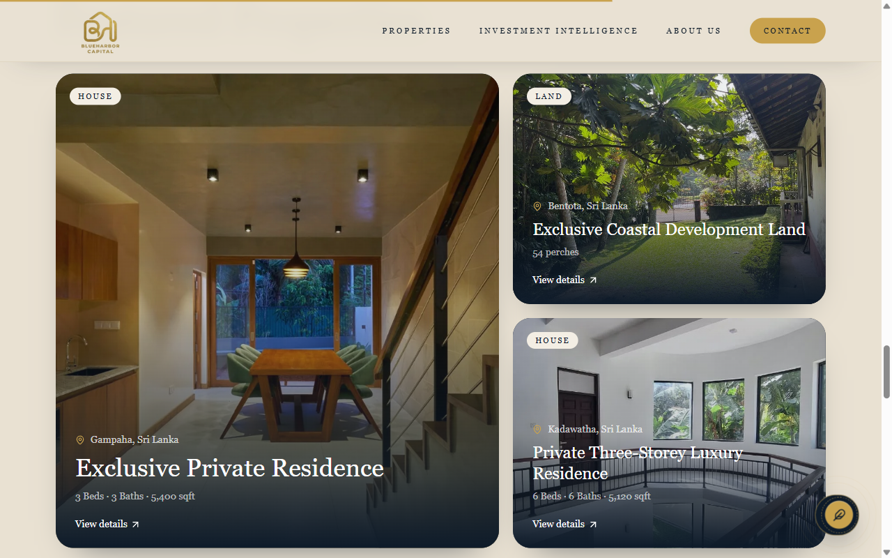
Layout
A property layout made for them.
We designed the opportunity cards so a house and a piece of land share one clear pattern: place, name, and a way through to the detail.
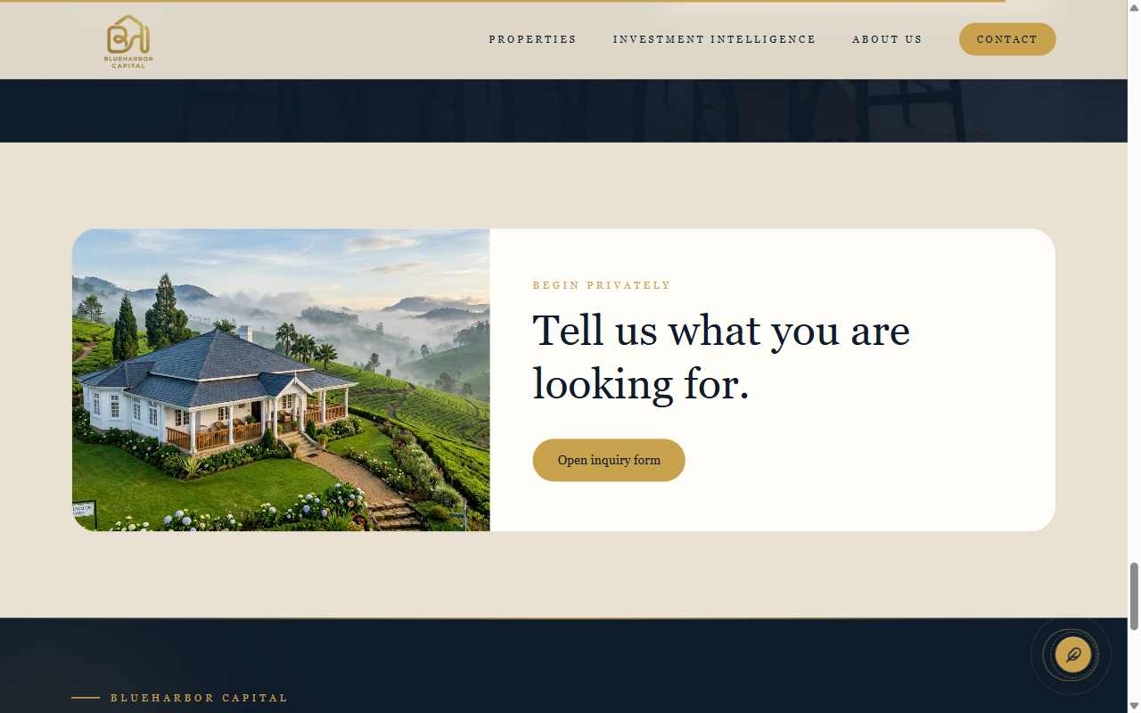
Inquiry
The inquiry is part of the page.
We placed a private inquiry on the page itself, so someone can describe what they want without leaving for a separate contact form.